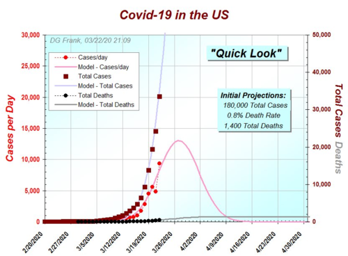
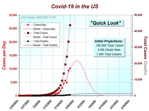
If I can read his graph correctly he is off a few days assuming the peak really was on the 21st and cases and deaths are going to have a continued downward trend.
He also missed the pink "cases per day" part of the model curve with peak daily cases hitting 6,557 on 3/21 and his model had it not making it to 4,000 cases per day.
I guess the pink line, and grey lines were his original model and now the red lines are the newer model? Current projection is for 100,000 cases and just under 12,000 deaths?
Of course this is assuming that the peak was on the 21st. There have been a couple times earlier where it looked like a peak and then the numbers shot back up again.
I'll be honest and say I don't know exactly. I know that is a lot of data and variables to make everything fit to scale on one graph. Most of his models aren't quite that busy and easier for me to understand. If you have FB, you really should friend the guy. He is teaching a class and then he is going to update his NY model later today. I'm pretty interested in those updated results.


