Gastro Gnome - Eat Better Wherever

COVID-19 Links, facts and discussion. Politics and hyperbole welcome.

Status
Not open for further replies.
This was irresponsible of Bullard. I may kill a Booner next season. Probably not, though.
Mnuchin said 20% and state-specific data shows we may be over that already. Maybe irresponsible, but not inaccurate. Bullard has never run away from a microphone, but I like the honesty and transparency.
 
CDC reports 12est Monday-Friday. This is the most recent release. Maybe I'm not following or maybe the news is reporting projections before CDC announcement. The model is based on U.S.

View attachment 132243

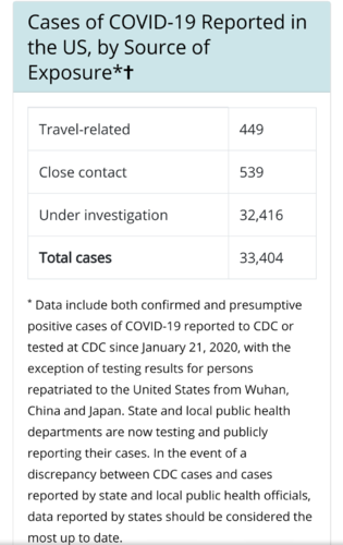
Those are reported to or tested at CDC *, I think their "reported to" component is lagging. It is widely reported we are north of 30k now.
 
Who collects the raw data to define u.s. cases? I didn't realize CDC is not accounting for any testing outside CDC.
 
Germany has 17 deaths from the prior day. 111 total. I agree they may see spike in deaths. Lots of factors too. More testing on live folks and likely all deaths are being tested for corona now. Where before that may not have been the case.

I’m not sure that’s how Worldometer is reporting for Germany as they’re up to 21 now.

They’re still at .4% which is higher than some flu numbers I’ve seen. I’ve seen flu death rates as low as .125%. Even flu numbers seem to vary considerably depending on source.
 
I wish the article shared more data.

I fear of inundating him by posting his Facebook page, but he models global and regional and posts it up daily. He is President at a precision analytical company and Math & Science Chair at the The Schilling School for Gifted Children in Ohio.

I like looking at his numbers vs looking at the headlines.

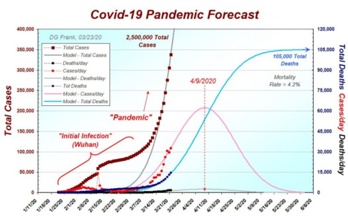
View attachment 132234
Here's a link that shows lots of his modeling. Here is his current prediction for the world. He also has models for some of the states and says he is still gathering data on the others, for those interested.


1584981518729.png
 
  • Like
Reactions: CiK

I wonder if they considered the fact there are about 61 million men 18-49 compared to 51 million men 50+ In the country?

edit: of both sexes there are around 130 million in the 18-50 age range and only around 103 million 50+

edit edit: from the article, the remaining 2%? 54+46=100

“Even though experts say the elderly are the hardest hit by the virus, just 46% of the city’s COVID-19 patients are over 50 while 54% are 18-49. The remaining 2% of cases are people age 5 to 17.”

I would like to see the statistics

20-30
31-40
41-50
51-60
61-70
71-80

Age adjusted to percent of population and broken down by men and women. That would be useful.
 
Last edited:
Interesting note from the mathematician that made the models above. I sure hope he is right!

Covid-19 “A Note About Predictions, or What’s Gonna Happen Next?”
- by Douglas G. Frank
I love making predictions using mathematics. Been doing it most of my life. I predict elections, epidemics, sun spots, weather, global warming, even the orbits of the moon. Great fun, and excellent pedagogy in the classroom. And I’ve become quite proficient at it; I am usually right because the mathematics usually works. Statistics can be powerful, used properly.

(For example, I predicted Trump’s win in 2016 over a year in advance, and I documented that prediction here. People thought I was crazy, but I stuck with the math.)

Predicting real-life phenomena is straightforward when natural phenomena are in control, or when enough things are happening such that the various cases can all average out. Nearly anything can be modeled if enough things are going on, and if you make lots of reasonable assumptions. (Scientists call these “Fermi calculations.”)

This is why all the epidemics have such a similar shape. They are the composite of myriad circumstances. When big enough, they average to a binomial distribution. (A “bell curve.”)

So a month ago, my Head of School came to me and she asked, “Your class has been modeling the Coronavirus epidemic. What do your calculations say about our planned class trip to the Baltic States?”

I told her that the pandemic would be peaking in Europe around April 1st (we nailed it). I told her that our children were at very little health risk (almost zero mortality rates for youngsters). But those were the easy predictions. Now for the hard question:

What would the various governments be doing *in response* at that time?

Well, it was logical to assume that they would be in panic mode, right in the middle of their pandemic. We would not be able to predict what actions they would take, but lots of them could be bad for us. President Trump had already started shutting down flights from other countries, so we could get stranded there. Local governments could quarantine our group if one of us coughed. We would be out of control of such variables, and would have fifteen lovely high schoolers under our care. So, we cancelled the trip.

Our mathematical models informed us to make some prudent decisions. But our math did not tell us what the various governments would do, only provide useful insight to guide our logic and reason. My Head of School is quite rational, and we work together on problems like this all time. Wow, did we make the right decision.

So, to the point. Even though the models are working splendidly, and assuming they continue to do so, we can’t predict what our federal and state governments are going to do. Nearly all of this should be over next month. We will have to be careful about secondary infections, of course, but basically we should be able to go back to work.

But… this is the hard part, sort of. Can we predict what the government will do? I think some governments, yes. Some, no. But just because we know the status of the pandemic doesn’t mean we know the status of our politicians. I have always said (ask my students) that whenever politics gets tangled up with science, it is a disaster.

Welcome to Disasterville.
 
Apparently, from the CDC website, CDC is the main collection for cases in the U.S.
If there are local discrepencies, refer to the individual local/state #'s as it's dependant on them to report to CDC and they may report end of day or every other, etc...

Based on that... People curious about the speed of the cases:

This is the new collection of total U.S. cases as reported to CDC, as of today.

Screenshot_20200323-110130.png

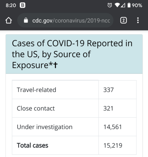
These were the total number of cases as of Friday with this info collected today just before their update @ 12est. People still questioning the severity we face?

Screenshot_20200323-082028.png
 
So back to Italy and my very basic math skills. Both new cases and deaths have dropped from Saturdays high. New cases 5,986; 6,557; 5,560; 4,789. Deaths 627, 793, 651, 601.

Is it a true peak? Really starting to look like it.

Extrapolating that into what numbers would end up looking like for the U.S. and it looks very encouraging compared to some of the early projections especially.
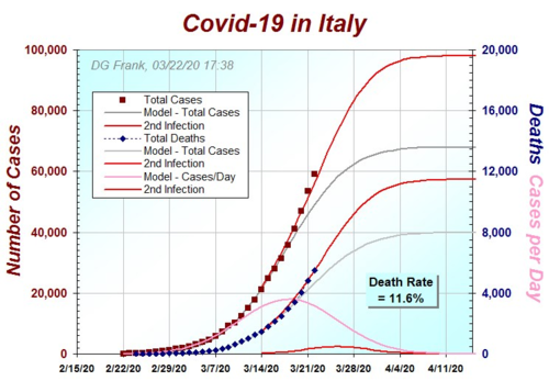
We can look at Mr. Frank's model and see if it correlates. Looks like he has his model peaking (cases per day - pink line) somewhere around 3/19 - 3/20.

1584987688548.png
 
I get the current strategy of buying time, flattening the curve, etc, but looking at the numbers, let’s even assume the actual infected is twice as many as the confirmed cases, in Italy that means about .2% of the population has had the virus, in China .01% maybe , herd immunity is 60%, where do we go from here? Does any government have a plan?
 
Interesting perspective here:

"We need to stop thinking of this through the lense of the United States vs Italy vs China vs Singapore, etc. The right way to think about it is by Metro Area."

"Each city in the US is a car driving toward a cliff. Now there are different sized cars and the cars are driving at different speeds and the cars have applied the brakes at different periods of time, and they have different tire qualities. Additionally they are all on different surfaces - some pavement some gravel."

As he says, even when you look at Italy, it doesn't make sense from a data perspective to look at Italy as one country. He points out that between Milan and Rome, there is a 40x difference in mortality. Between Milan and Sicily - a 300x difference in mortality rates.

It's an instagram video, but makes sense to me and was a way of looking at the US as whole relative to other countries that I hadn't thought of.


So back to Italy and my very basic math skills. Both new cases and deaths have dropped from Saturdays high. New cases 5,986; 6,557; 5,560; 4,789. Deaths 627, 793, 651, 601.

Is it a true peak? Really starting to look like it.

Extrapolating that into what numbers would end up looking like for the U.S. and it looks very encouraging compared to some of the early projections especially.

I don’t know if it’s a true peak or not, but if that was the true peak then this is way overblown. At a maximum that’s a 45% increase in the daily average of all cause deaths. During the 1918 Spanish Flu Italy experienced a 172% increase FOR THE YEAR, therefore, the current worst day in Italy is 1/4 that of Italy’s daily average during the Spanish Flu.
 
Last edited:
Interesting perspective here:

"We need to stop thinking of this through the lense of the United States vs Italy vs China vs Singapore, etc. The right way to think about it is by Metro Area."

"Each city in the US is a car driving toward a cliff. Now there are different sized cars and the cars are driving at different speeds and the cars have applied the brakes at different periods of time, and they have different tire qualities. Additionally they are all on different surfaces - some pavement some gravel."

As he says, even when you look at Italy, it doesn't make sense from a data perspective to look at Italy as one country. He points out that between Milan and Rome, there is a 40x difference in mortality. Between Milan and Sicily - a 300x difference in mortality rates.

It's an instagram video, but makes sense to me and was a way of looking at the US as whole relative to other countries that I hadn't thought of.


That is a good point.
 
We can look at Mr. Frank's model and see if it correlates. Looks like he has his model peaking (cases per day - pink line) somewhere around 3/19 - 3/20.

View attachment 132286

If I can read his graph correctly he is off a few days assuming the peak really was on the 21st and cases and deaths are going to have a continued downward trend.

He also missed the pink "cases per day" part of the model curve with peak daily cases hitting 6,557 on 3/21 and his model had it not making it to 4,000 cases per day.

I guess the pink line, and grey lines were his original model and now the red lines are the newer model? Current projection is for 100,000 cases and just under 12,000 deaths?

Of course this is assuming that the peak was on the 21st. There have been a couple times earlier where it looked like a peak and then the numbers shot back up again.
 
Status
Not open for further replies.
Ollin Magnetic Digiscoping Systems

Latest posts

Forum statistics

Threads
114,283
Messages
2,051,017
Members
36,535
Latest member
Gila Horizon
Back
Top