"Promo Code: Randy" Master List + Sitka Gear on Sale

NKQualtieri

Well-known member
Joined
Jun 4, 2015
Messages
330
Location
Bozeman, MT
Hey team —

We're doing some big-time organizing over here to make things easier for everyone to find. Basically, we're building a small hub of written media over at HTTP://www.hunttalk.com/strategy. This will include gear lists, basic how-to info, and whatever else seems good for sharing.

We're keeping a master list of every active promo code that will be updated as different deals shift and change.

Find the master list here:

https://www.hunttalk.com/strategy/2023/04/05/discounted-hunting-gear/

I am also a devoted finder of deals, and I'll be updating a monthly article for Sitka sales gear since we aren't able to offer a direct discount. The caveat is that I'll make sure that each item is available in multiple if not all sizes. I'm aiming for five items per month.

Monthly Sitka Gear Sale Update:

https://www.hunttalk.com/strategy/2023/04/07/sitka-gear-sale/

If I find a good deal that doesn't fit into an article, I'll throw it in this thread I'm using for one-off gear deals.

Let me know thoughts or any brands that — within the spectrum of what we can do — you're looking to save cash on. Obviously, competitors to the brands we work with are a sticky area for us, but outside of that, we have a lot of room to build relationships.

Thanks all -

Nicole Q
Fresh Tracks/Hunt Talk Team
 
Last edited:
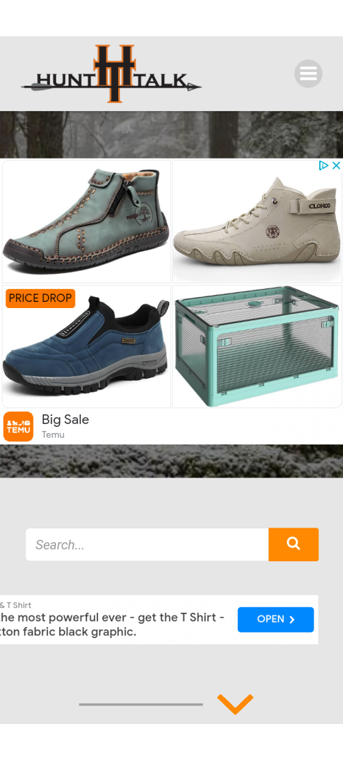
One of the things that initially drew me to HT was the lack of adds dominating every conceivable space where you could put one. I was caught off guard a little when the first thing that showed up on the screen was an advertisement (2).
Screenshot_20230411-200528.png
 
One of the things that initially drew me to HT was the lack of adds dominating every conceivable space where you could put one. I was caught off guard a little when the first thing that showed up on the screen was an advertisement (2).
View attachment 271694
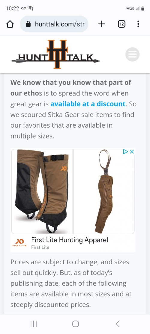
I found it interesting that when I clicked on the Sitka link, I saw more First Lite adds then Sitka stuff on sale.
 
One of the things that initially drew me to HT was the lack of adds dominating every conceivable space where you could put one. I was caught off guard a little when the first thing that showed up on the screen was an advertisement (2).
View attachment 271694
We are trying to work out the responsive ads issue, I'm not sure why it's showing up that big, that is wild! Is that on mobile?

This is totally a test period, so bear with us as we try to figure it out. But responsive ads are a pretty normal part of written content these days. We will dial it in, but figured the HuntTalkers would let us know if issues like this came up. We haven't shared this content anywhere else, as it def needs work.

Also, I love this kind of feedback so please feel free to let us know when something looks wonky. I'm not a developer but we have one who helps out.
 
Yeah that's a responsive ad. It changes from person to person. If you look at literally any page on the internet, responsive ads exist. I bet if you go look at like, water guns, it will be water guns the next time you go there.

Like I said, we're working out the kinks so this is super appreciated!
 
We are trying to work out the responsive ads issue, I'm not sure why it's showing up that big, that is wild! Is that on mobile?

This is totally a test period, so bear with us as we try to figure it out. But responsive ads are a pretty normal part of written content these days. We will dial it in, but figured the HuntTalkers would let us know if issues like this came up. We haven't shared this content anywhere else, as it def needs work.

Also, I love this kind of feedback so please feel free to let us know when something looks wonky. I'm not a developer but we have one who helps out.
I'm not gonna write off the page, yet!🤔

Yes, it was on mobile.

Like I said before, the primary thing that keeps me coming back here is the ABSENCE of responsive ads in the primary viewing window. On HT Forum it's buried at the top and bottom so it never interferes with my experience the way it does in other forums. By the layout of this website for all these years, I would have bet my firstborn this was an intentional and purposeful decision by Randy (I joined after Moosie let it go to Randy) to make sure adds don't interfere with the experience. This page was the exact opposite. Not saying responsive ads are wrong, and you have to pay to keep the lights on, so I get it. It's just a breath of fresh air when I visit a page that doesn't have them plastered everywhere. It's actually what keeps me from getting recipes from Hunter Angler Gardner Cook. I can't stand the targeted adds and mobile popups, so I don't visit his page.
It's not going to affect the forum. We have to figure out what we want it to look like on the side of written content.

If you read any online newspaper, blog, or form of content, you're going to get the same thing. It's a part of the landscape, and a best practice for how media works in a space where users get great content for free. People used to pay for newspapers; the world has changed.

And on that note, it's no different than reading a print newspaper with ads on the sides, except now the ads know what you're searching. We can do our best to make it less egregious and invasive, and this feedback is helping us dial it in. But responsive ads will be a part of our written side of the work we do. It's part of the whole picture.

And if it's not for you, that's totally fine.
 
Here's the deal...visiting any site leaves a traceable foot/finger print. Yes responsive ads are an annoying first world problem...click em away.

Thanks again Nicole. Now, back to the mouse trap.
 
Back
Top