Leupold BX-4 Rangefinding Binoculars

OYOA Logo - Input please

Which image do you like best for OYOA logo gear?

  • Logo #1

    Votes: 7 5.9%
  • Logo #2

    Votes: 5 4.2%
  • Logo #3

    Votes: 12 10.2%
  • Logo #4

    Votes: 35 29.7%
  • Log #5

    Votes: 3 2.5%
  • None - Start over Fin

    Votes: 56 47.5%

  • Total voters
    118

Big Fin

Administrator
Staff member
Joined
Dec 27, 2000
Messages
16,735
Location
Bozeman, MT
This logo process takes a lot longer than I ever thought.

The goal is to produce an image that when people see it, they will know it represents your brand.

With that, I have chosen to work with two items:

1. Compass - Going our own direction and knowing we are going the right direction.

2. Bighorn Sheep - Bold, a survivor, and represents the pinnacle of North American hunting.

I know some of you guys expected me to use the pronghorn as our logo, and was tempted. Still may, if none of these cut it.

So, give me your vote of your favorite of these files. That will help us pick the best of this batch. And, it might be what we end up with.

Most important is recognition, first impression, and ability to print or embroider.

We will use this logo for hats, shirts, decals, etc.

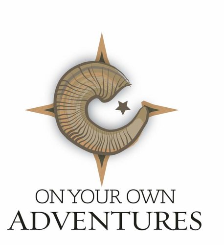
#1
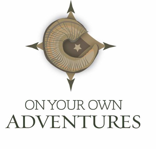
OYOA_logo_1.jpg

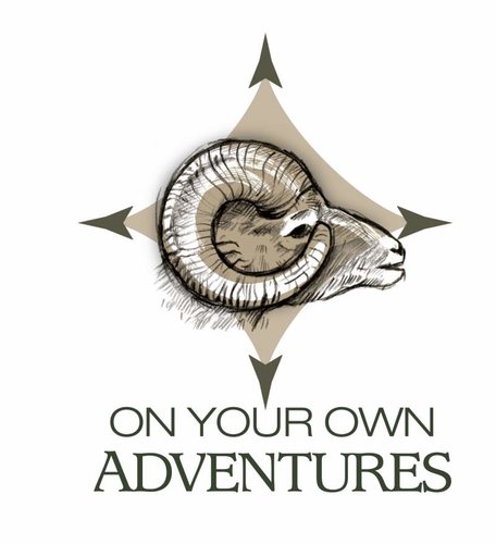
#2
OYOA_logo_2.jpg

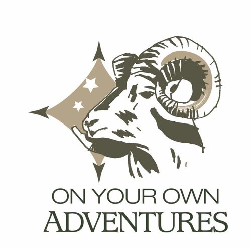
#3
OYOA_logo_3.jpg

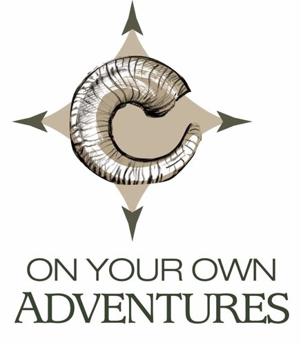
#4
OYOA_logo_4.jpg

#5
OYOA_logo_5.jpg

Interested in your thoughts.
 
LOVE #4... Be 100% sure you are not infringing on anyone's trade dress. Seems like I have a new start up every other year that I have to explain this to. I'd imagine being a top notch org you are 100% original, just trying to give a heads up that sometimes even accidents can happen with original work...
 
These are all originals, as represented by the graphic design group. They have worked hard and given me a ton of samples. I doubt these could be found "off the shelf." Or, I sure hope not.
 
I voted for none of the above and here is why. I just love the original logo of the compass and the mountains and see zero reason for a change. Why bring in a species of big game to a logo? Once you do that, IMO, you have created a bias because there are so many, why not bear, why not lopes, why not ?....

I say leave it alone...my 2 cent.
 
I like #1 & #2 and don't see myself sporting anything with #3 or #4. I'd be interested in seeing something similar to the first two but with an antelope as it's unlikely I'll ever be able to associate myself with a bighorn.
 
I voted none of the above, but I could live with #4.
Really, what ever you want, your the 'BIG CHEESE".
 
Would have to go with #1 if forced to choose, but not really sure any are bold and eye catching. If you want to go with a ram, have they tried anything with a head on view of set of rams horns? Just a thought. Are the stars symbolic of something? or just space fillers? Like the compass.......
 
Fin,

You are right a logo represents your brand...your brand is OYO and those letters along with the compass speaks to all of us not just the big horn fans, prong horn fans, etc...Your product is the adventure. How many of us other than Greenhorn and Buschy have at times ate a tag but still had the best hunt ever. JMO:)
 
Good comments. That is why I ask for input. Hope you guys don't want paid for these comments.
 
There all good it was close for me though on #3 and #4, I like the sheep in #3 but it just seems like its missing somthing so #4 it was. At first glance #1 and #2 looked like snail shells to me, and I tried to pretend I never seen the show and I just seen the logo, all I could do was envision a treasure hunting tourist show on some beach somewhere on the Travel channel, I like them but I think they need a sheep head in there as well if you go that direction. I kind of like the old stand by the most though.
 
I voted for none of the above and here is why. I just love the original logo of the compass and the mountains and see zero reason for a change. Why bring in a species of big game to a logo? Once you do that, IMO, you have created a bias because there are so many, why not bear, why not lopes, why not ?....

I say leave it alone...my 2 cent.

I agree, stay with the compass and mountains.
 
I did not vote for any and think the current logo is good. That said I do like the look of the compass in the sketches. How about that compass with no stars and N, S, E, W and then keep the rest of your current logo.
 
I voted for #3 but also think that it would be better with a elk rack instead of a bighorn or a prong rack also,what about a different critter at each compass point?the emphasis is on your own so maybe a d.i.y. in there somewhere too?my 2 cents.keep the n,s,e,w, on your compass.
 
#4 - instant impression, this one grabbed me over the others.

So when do the shoulder patches get released so we can have em stitched onto our favorite hunting garb?
Maybe some nice wick free long sleeve tee-shirts with a small version of the logo top centered rear neck area...?
Some subtle clean looking "flexfit" ball caps with the logo on front with OYOA on back...

Etc, etc, etc!


Nice looking design. Enjoy the reasoning behind the compass and Ram.

oh, and a nice truck window logo sticker?
 
None of the above.
I don't think of "on your own" when I see the compass.
I don't think of "On your own" when I see a Sheep head.

When I see a guy with a pack on his back, I think of On Your Own.
Add a Sheep head to the Pack and put it on Randy's back and I think you have something.
 
I agree with "non of the above". As a matter of fact if I do ever draw a sheep tag I will likely higher an outfitter so it wil not be OYOA. Why bring a species into it? I think what you have works pretty well.
 
I like the mtns and compass logo, as I feel that more truly represents the ideal of OYOA. With gumption and work, you can if you want to kind of thing. I don't like the idea of the bighorn. Way to limited of a hunt and too lofty of a goal to reach the Average Hunter, who I think is probably your biggest audience target. Unless the star is at the north compass arrow, I'd say drop it as it looks too much like some eastern European flag...and in a Stan country.

I'd think something like #4 with a generic mtn/stream (something simple like the BLM logo) in place of the sheep would be great.
 
Use Promo Code Randy for 20% off OutdoorClass

Forum statistics

Threads
113,671
Messages
2,029,130
Members
36,277
Latest member
rt3bulldogs
Back
Top